注意
前往页面底部 下载完整的示例代码。
plot_contour
- optuna.visualization.matplotlib.plot_contour(study, params=None, *, target=None, target_name='Objective Value')[源代码]
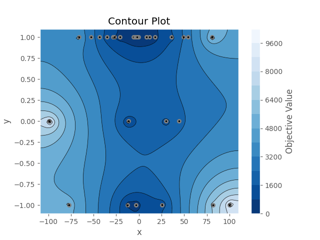
使用 Matplotlib 以等高线图的形式绘制研究中的参数关系。
请注意,如果参数包含缺失值,则不绘制具有缺失值的试验。
另请参阅
有关示例,请参阅
optuna.visualization.plot_contour()。- 参数:
- 返回:
一个
matplotlib.axes.Axes对象。- 返回类型:
注意
于 v2.2.0 添加为实验性功能。接口可能在未来版本中更改,恕不另行通知。请参阅 https://github.com/optuna/optuna/releases/tag/v2.2.0。
以下代码片段展示了如何绘制参数关系的等高线图。
/home/docs/checkouts/readthedocs.org/user_builds/optuna/checkouts/stable/docs/visualization_matplotlib_examples/optuna.visualization.matplotlib.contour.py:25: ExperimentalWarning:

optuna.visualization.matplotlib._contour.plot_contour is experimental (supported from v2.2.0). The interface can change in the future.


<Axes: title={'center': 'Contour Plot'}, xlabel='x', ylabel='y'>
import optuna


def objective(trial):
    x = trial.suggest_float("x", -100, 100)
    y = trial.suggest_categorical("y", [-1, 0, 1])
    return x**2 + y


sampler = optuna.samplers.TPESampler(seed=10)
study = optuna.create_study(sampler=sampler)
study.optimize(objective, n_trials=30)

optuna.visualization.matplotlib.plot_contour(study, params=["x", "y"])
脚本总运行时间: (0 分钟 0.488 秒)